Component Library
Windmill provides a set of components that can be used to build apps.
The app components library is located on the right-hand side of the app editor. It displays the app components and allows you to configure them.
The list of components is constantly growing according to our users' expectations. If you feel like a new component would be useful, please reach out to us.
Even though the list of components is never as up to date as on Windmill Cloud, here is the list of the available components:
Components properties
Components can be configured in two ways:
-
Inputs: inputs can be connected to an output or computed using a runnable.
- e.g.
Tablecomponent has an input that can be connected to an output or computed using a runnable, which is an array of objects.
- e.g.
-
Configuration: configure property such as the button label, the text input placeholder, etc.
- e.g.
Tablecomponent has a configuration property that allows you to configure the search bar: Client-side search, Server-side search, or no search.
- e.g.
Component outputs
-
Runnable: some component can trigger a runnable when an event occurs, usually when a user interacts with the component. The result of the runnable is stored in the component output in the key
result. It also stores theloadingstate of the component.- e.g.
Buttoncomponent can trigger a runnable when clicked.
- e.g.
-
Own outputs: some component have outputs defined by the component.
- e.g.
Tablecomponent has a selectedRow output
- e.g.
Inserting components
Click on a component in the component library to insert it in the app canvas. It will be automatically positioned to the first available spot starting from the top left corner.
Layout
The layout components are used to organize the components in the app canvas.
Container
Containers allow you to host other components in a box. Moving a container means moving all the components inside.
List
The List component enables duplication of cards or rows with consistent structure, allowing for containment of other components. By default, editing or moving a component will apply changes to all cards or rows, while still allowing customization and exceptions for unique values per component.
Divider X
Divider X is a horizontal line.

Divider Y
Divider Y is a vertical line.

Drawer
The drawer is container called by a button. Once you click on the button, a side tab will appear on which you can display other components.
Vertical Split Panes
Split panes component is a container split in x number of panes vertically.
Horizontal Split Panes
Split panes component is a container split in x number of panes horizontally.
Modal
The modal is container called by a button. Once you click on the button, a modal will appear on which you can display other components.
Stepper
The stepper component helps you lay out multi-step apps, with an optional validation function to validate a step.
Carousel List
The Carousel List component enables duplication of cards or rows with consistent structure in a carousel, allowing for containment of other components. By default, editing or moving a component will apply changes to all cards or rows, while still allowing customization and exceptions for unique values per component.
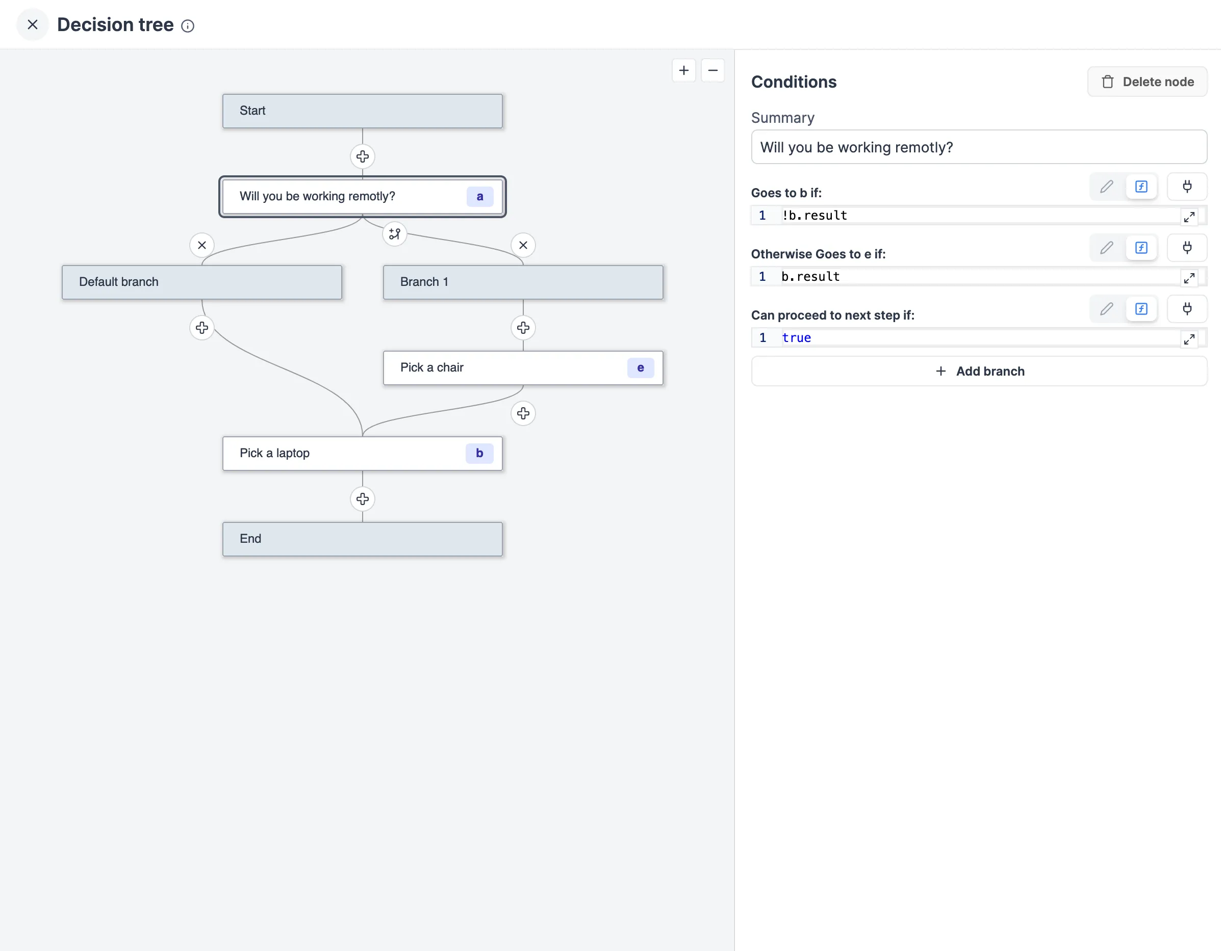
Decision Tree
This app component allows you to create a decision tree controlled by a flow-like structure. Each node in the tree represents a decision point with a dedicated subgrid and can lead to one or more subsequent nodes based on specified conditions.
Navbar
The navbar component facilitates control over the browser's URL bar, enabling:
- Changing the behavior of the app by manipulating the query arguments and hash of the URL.
- Opening an external URL in a new tab.
- Opening another Windmill app, which allows for creating embedded apps where the user navigates between several of your Windmill apps.
Recompute all
The Recompute all component allows you to recompute all elements in the app.
Top Bar
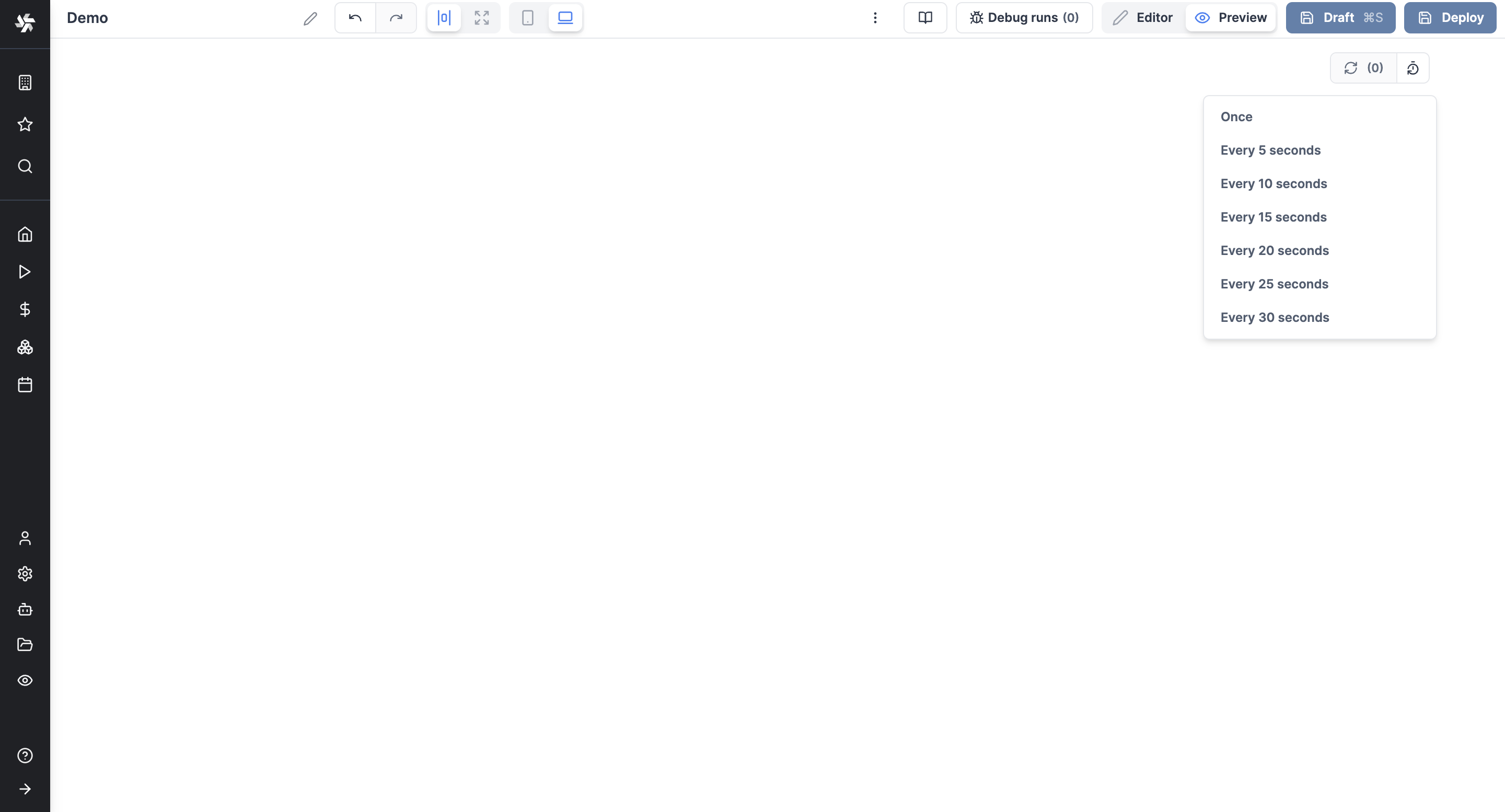
The Top Bar component displays a top bar on your app, with the app Summary and the Recompute all button.
Tabs
Tabs
Tabs components allow you to host other components in several tabs. Each tab is a container.
Conditional Tabs
Conditional Tabs are tabs that are displayed only if a condition is met. The conditions are an array of conditions. Conditions are evaluated in order. The first condition that evaluates to true will render its subgrid. If no condition evaluates to true, the last subgrid will be rendered.
Sidebar Tabs
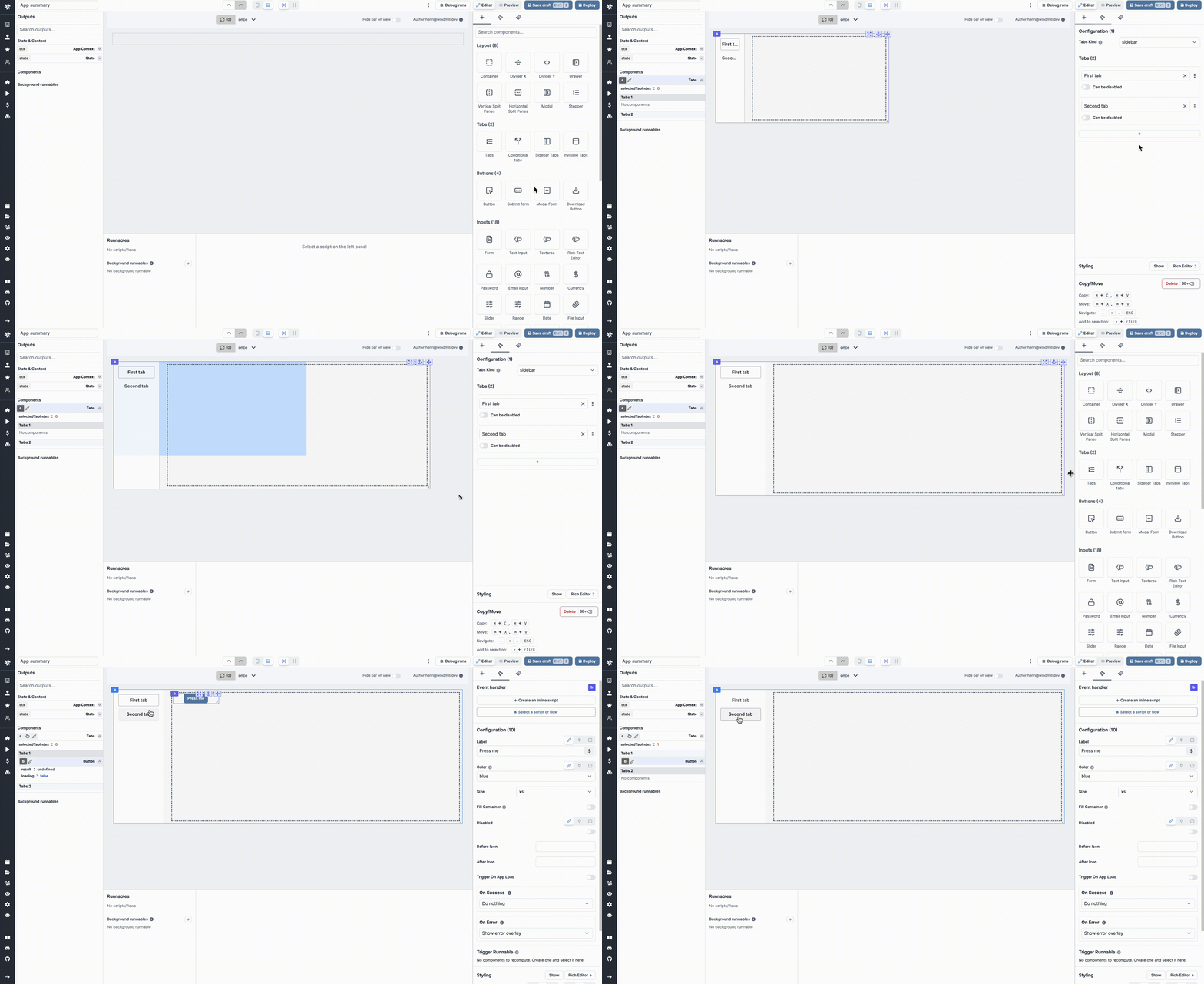
The Sidebar Tabs component is basically a Tabs component whose Tabs Kind is "Sidebar".
Invisible Tabs
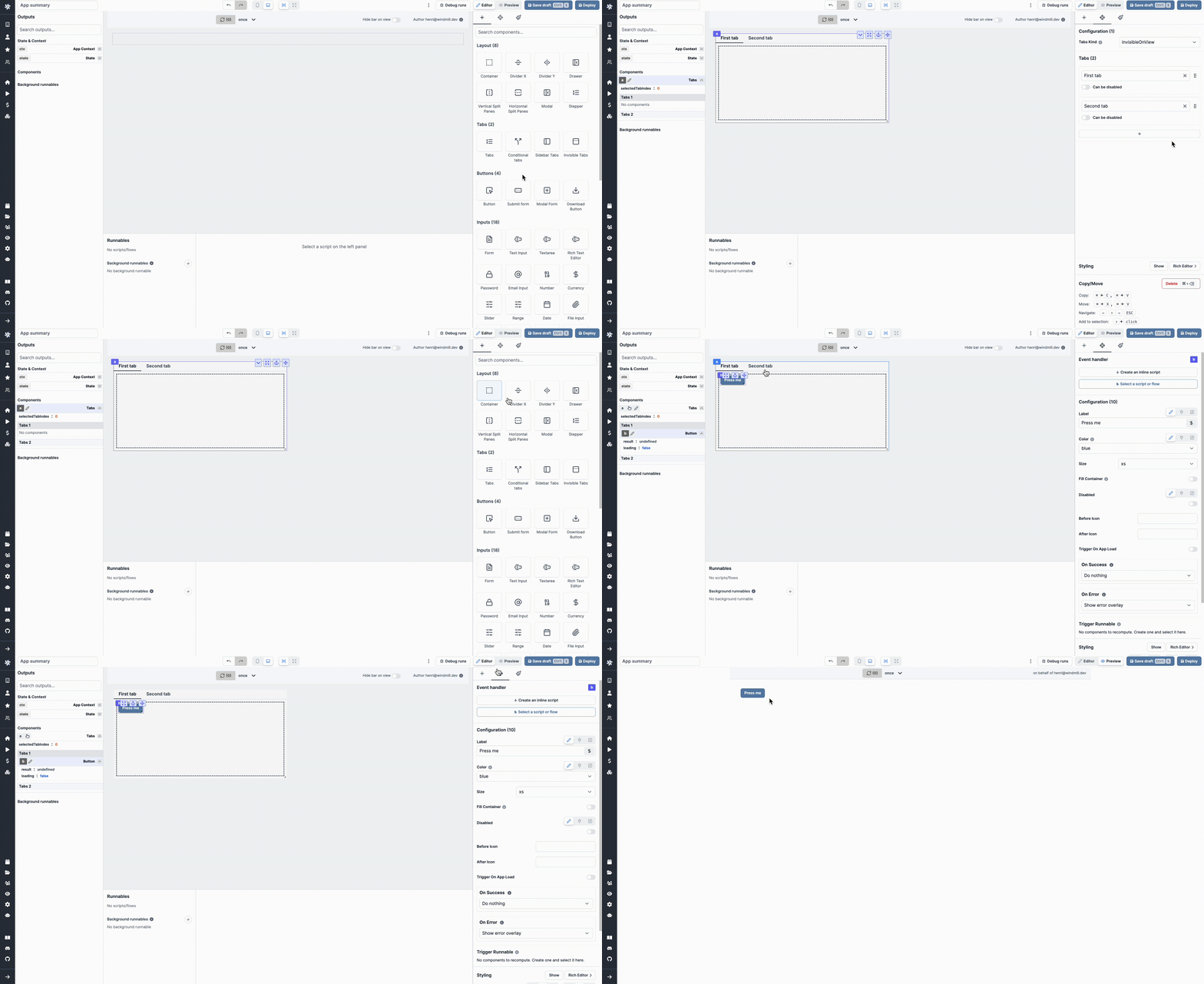
The Invisible Tabs component is basically a Tabs component whose Tabs Kind is "Invisible", meaning the tabs labels are not visible by the user.
Buttons
Button
The component triggers a runnable when clicked.

Submit Form
The submit form component allows you to create a submit form linked to a runnable. It has a submit button that triggers a runnable when clicked.
Modal Form
The modal form component allows you to create a form linked to a script or flow. It is a Submit Form component but with a dedicated modal opened when triggered. It has a submit button that triggers a runnable when clicked. The form is displayed in a modal, which can be opened by clicking on a button.


Download Button
The download button component allows you to download a file.
Inputs
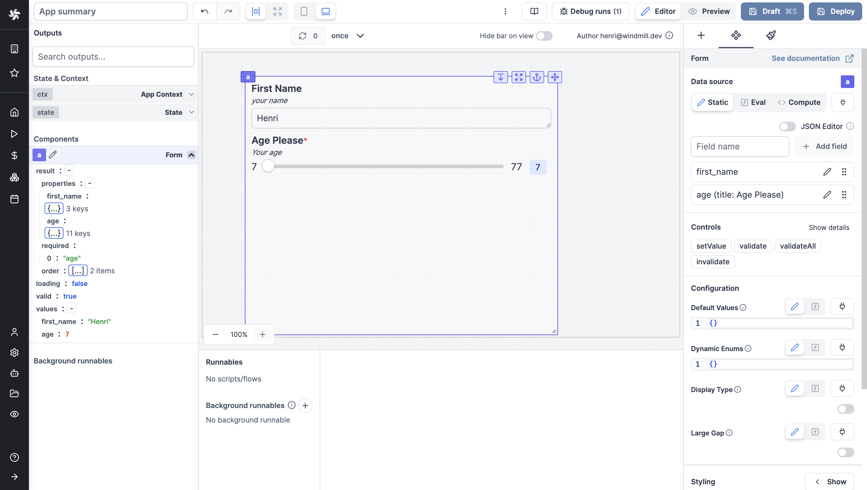
Form
The Form component allows you to create a form and get answers from the user.
Text Input
The text input component allows you to get a string from the user.

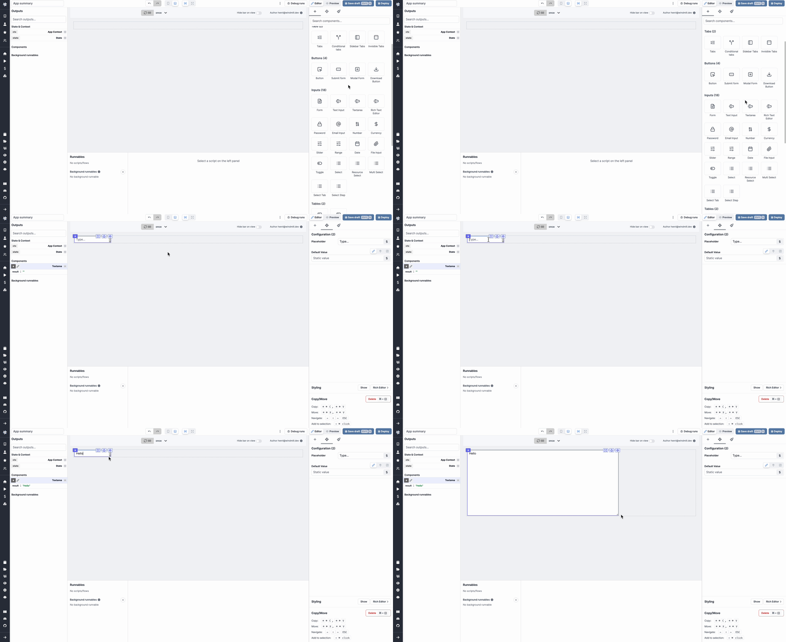
Textarea
The textarea component allows you to get a string from the user, with an expandable text area.
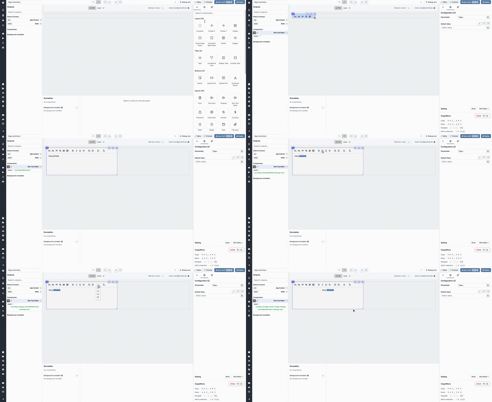
Rich Text Editor
The Rich Text Editor component allows to have to user enter text with a layout, on top of files or videos.
Password
The password input component allows you to get a password from the user.

Email Input
The email input component allows you to get an email from the user.

Number
The number input component allows you to get a number from the user.

Currency
The currency input component allows you to get a written amount of money in a set currency from the user.

Slider
The slider component allows you to get a number from the user.

Date Slider
The slider component allows you to get a date from a range of dates.

Range
The slider component allows you to get a range of numbers from the user.

Date
The date input component allows you to get a date from the user.

Time
The Time Input component allows the user to fill in a time.
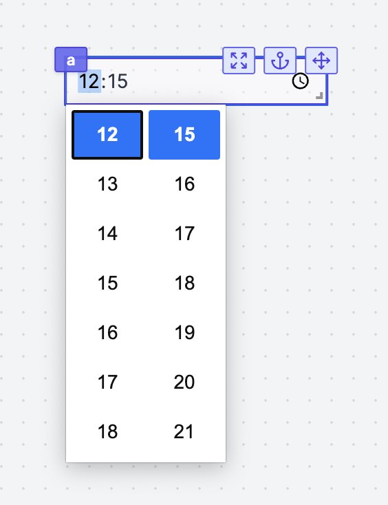
Date & Time
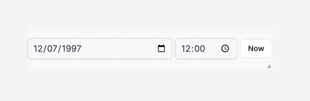
The Date & Time Input component allows the user to fill in a date and time.
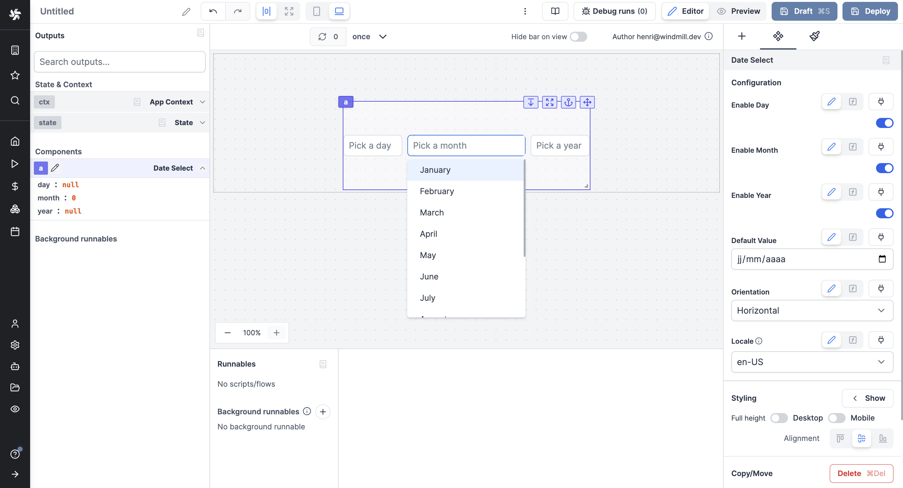
Date Select
The Date Select component allows the user to fill in a date by picking a day, month and year.
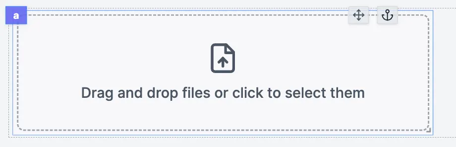
File Input
The file input allows users to drop files into the app.
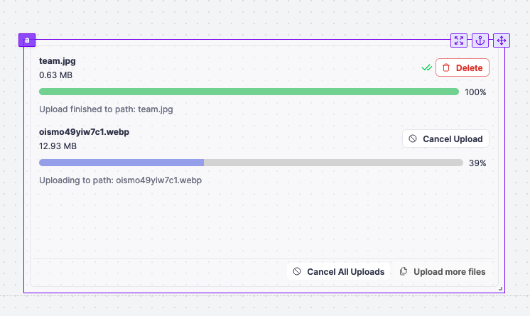
S3 File Uploader
The S3 File Uploader component allows you to upload files to an S3 bucket.
Toggle
The toggle component allows you to get a boolean from the user.

Select
The select component allows you to get a string from the user.

Resource Select
The Resource Select component allows you to have users pick resources from your Windmill workspace to interact with integrations.
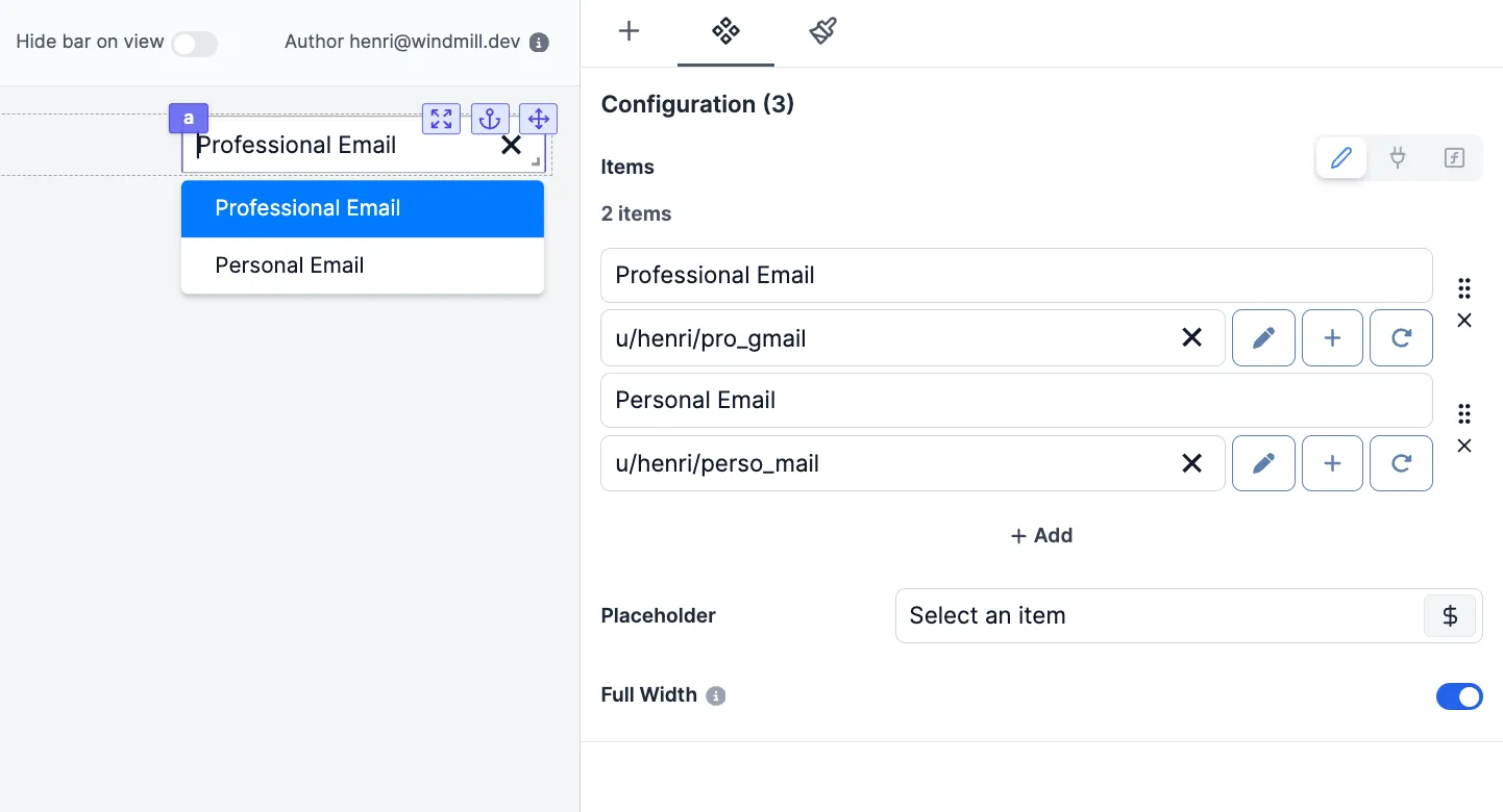
Multi Select
The Multi Select component allows you to get multiple strings from the user.

Select Tab
The Select Tab is standalone tab component that behaves like a select component. It is meant to have the chosen tab to be chosen as input by components or runnables.

Select Step
The Select Step is standalone tab component that behaves like a select component. It is meant to have the chosen tab to be chosen as input by components or runnables.

Tables
AgGrid Table
The AgGrid table component allows you to display an Ag Grid table.
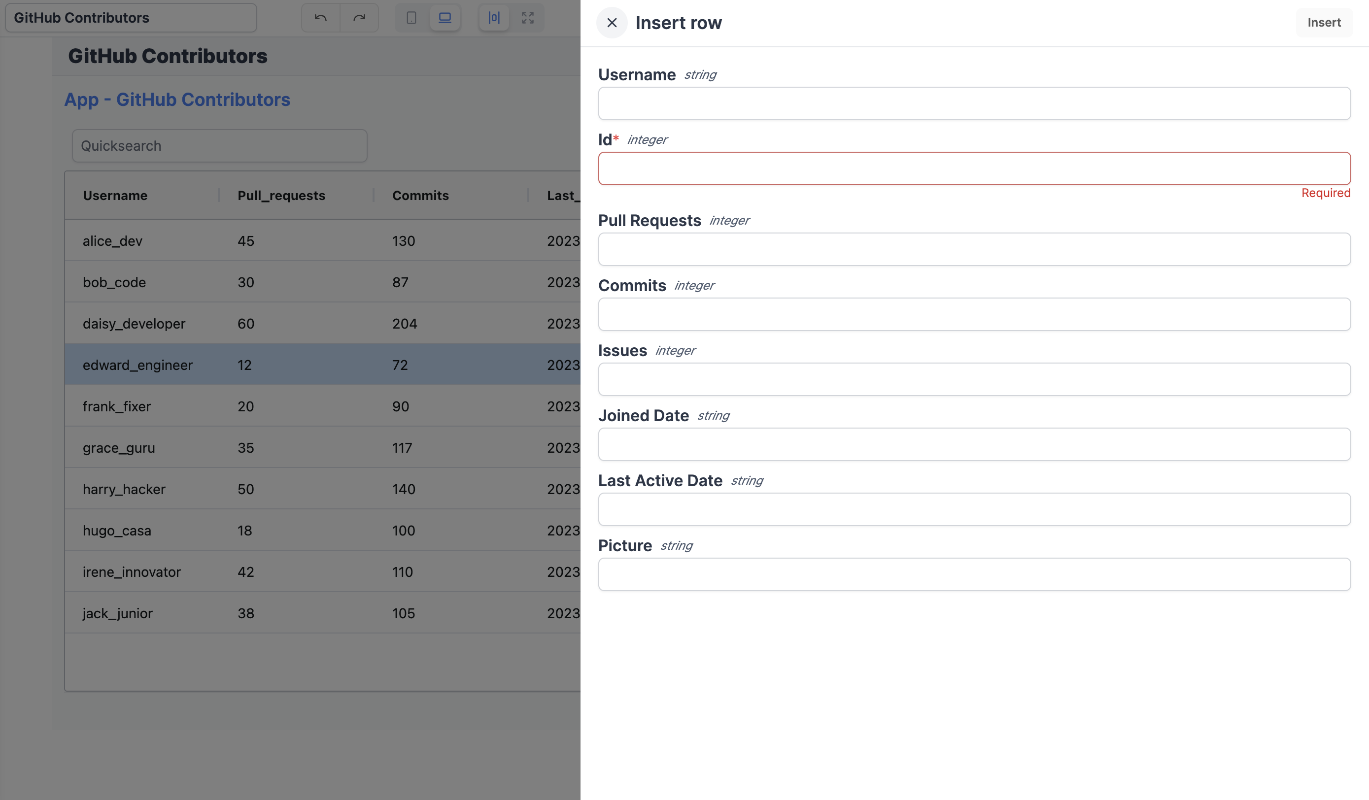
Database Studio
This component allows you to create a database studio. The database studio is a web-based database management tool. It allows you to display and edit the content of a database. It uses Ag Grid to display the table.
TanStack Table (Depreciated)
The table component allows you to display a table.
integrationsand will be removed in the future. Please use the AgGrid Table or Database Studio components instead.

Display
Text
The text component allows you to display text.

Icon
The Icon API allows you to display an icon chosen in a library of icons.

Image
The Image component allows you to display a picture.

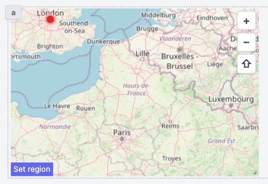
Map
The Map component allows you to display an interactive map.
HTML
The HTML component allows you to display HTML content.

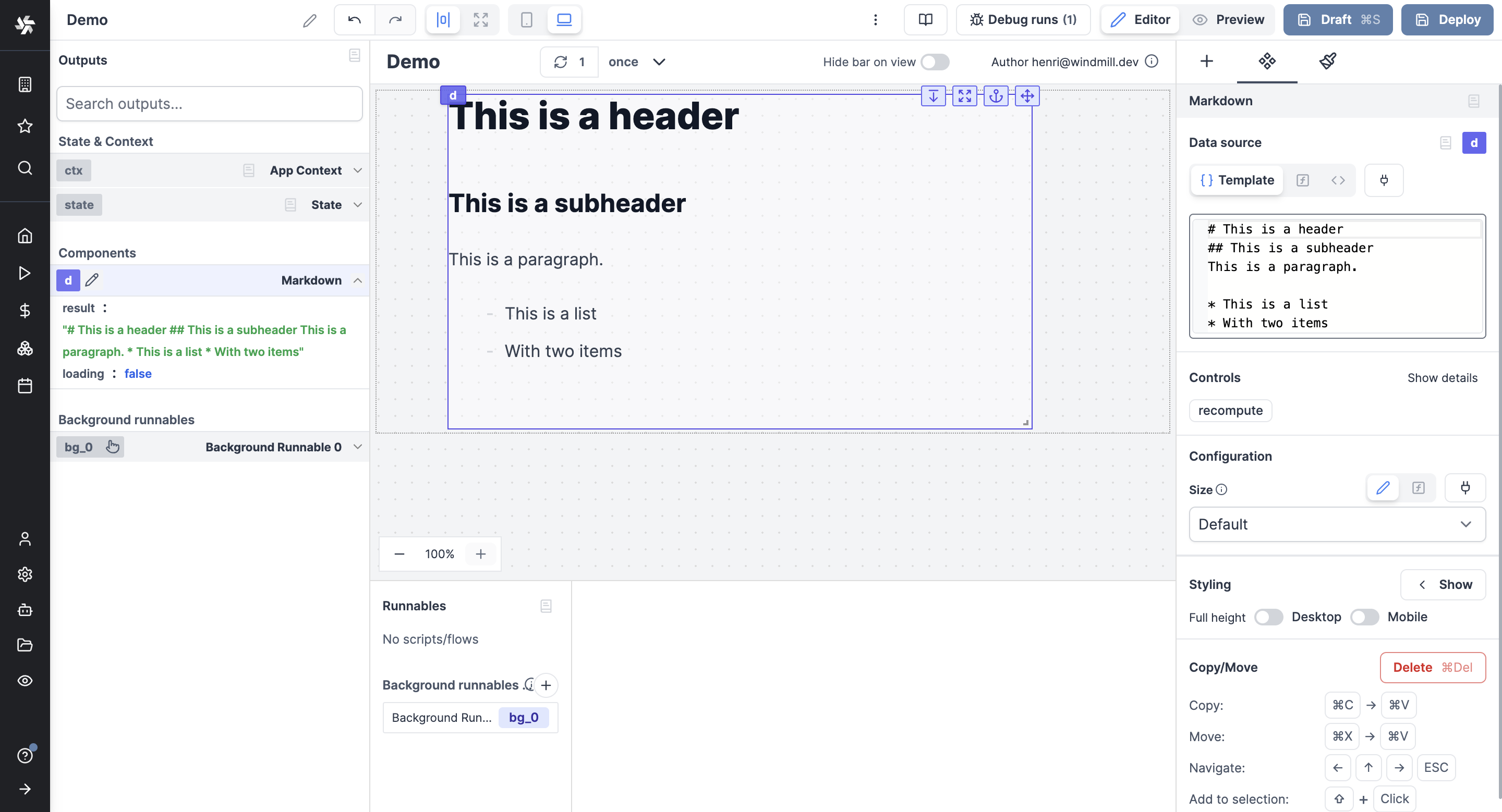
Markdown
The Markdown component allows you to display Markdown content.
PDF
The PDF component allows you to display a PDF file.

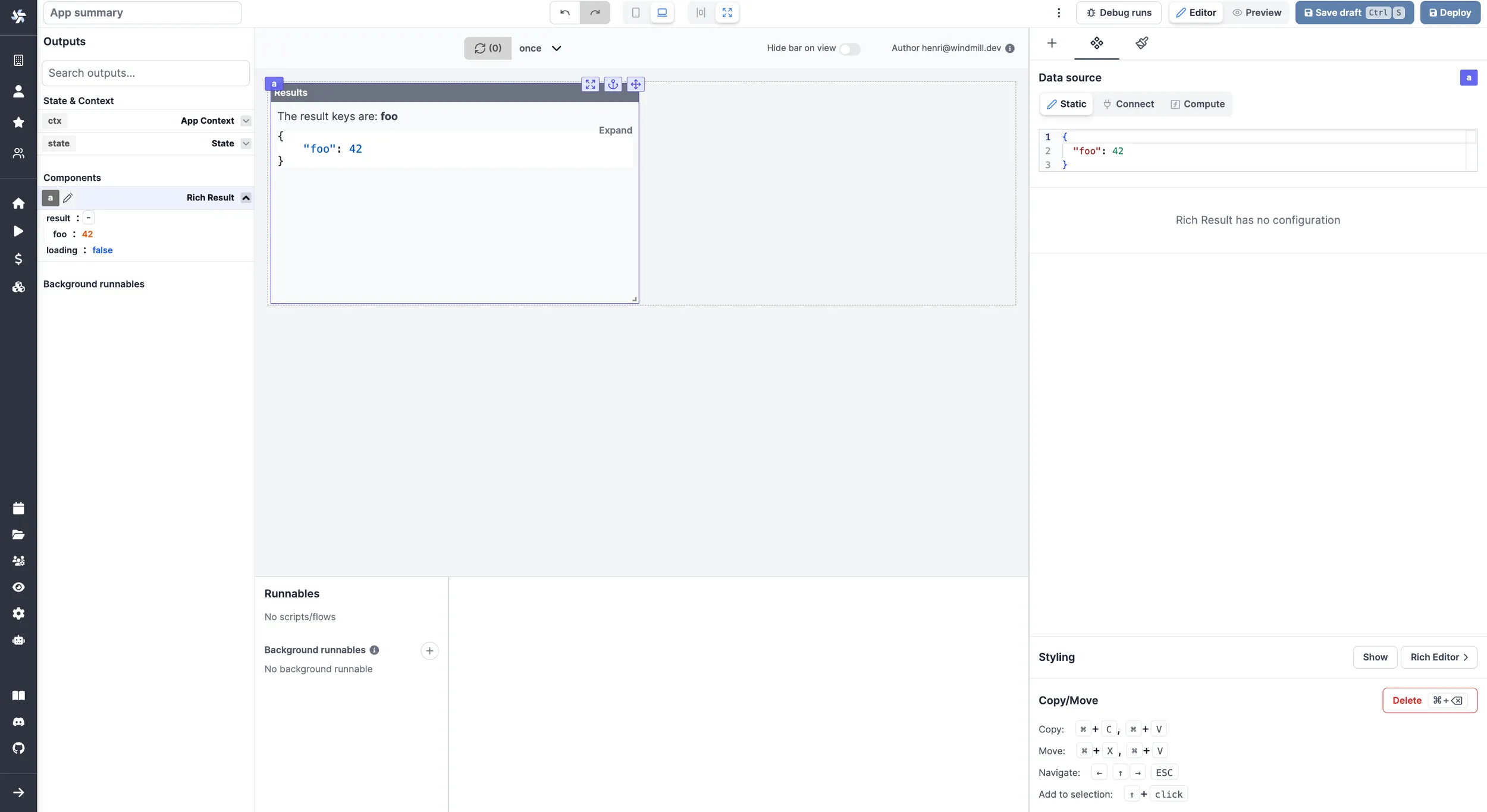
Rich Result
The Rich Result component allows you to display the result of a Runnable.
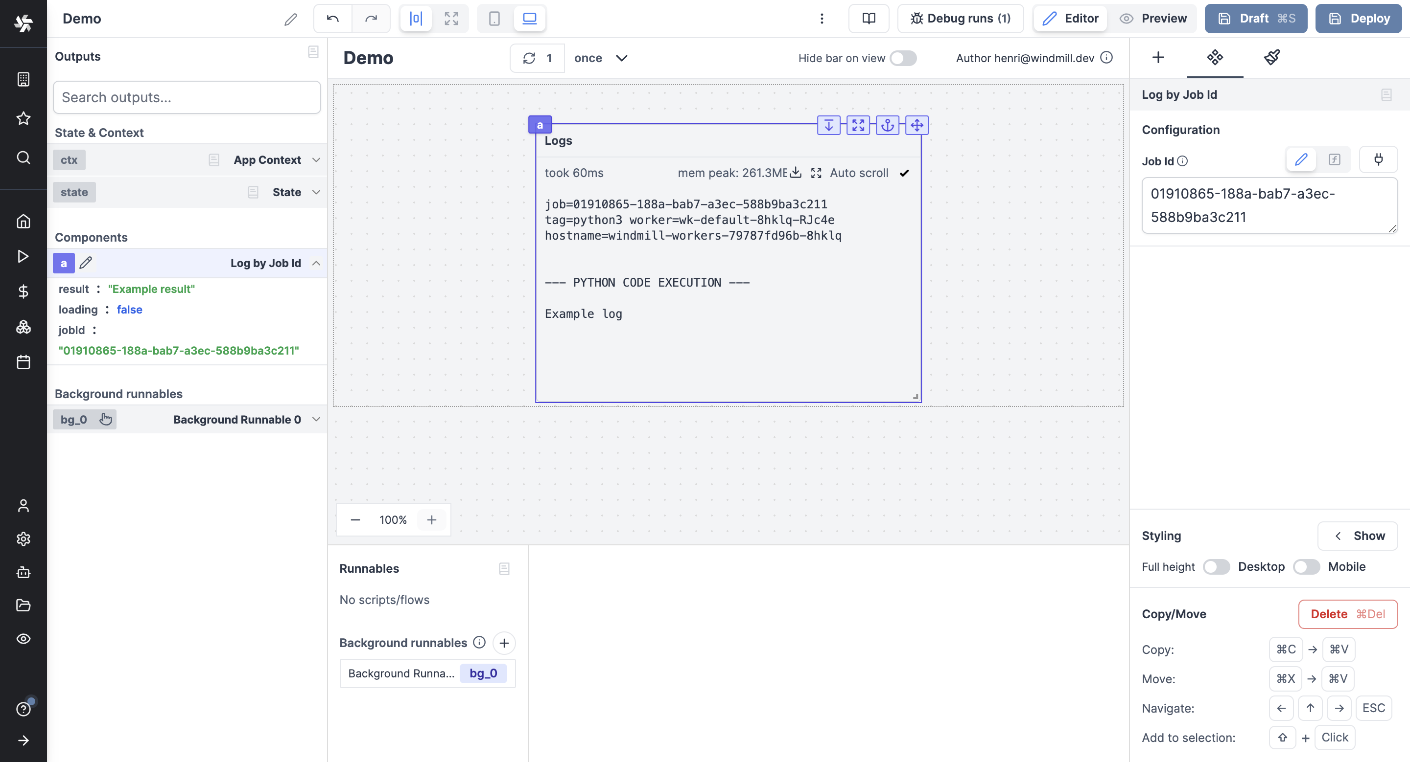
Log by Job Id
The Log Display component allows you to display the log of a Runnable by providing its Job id.
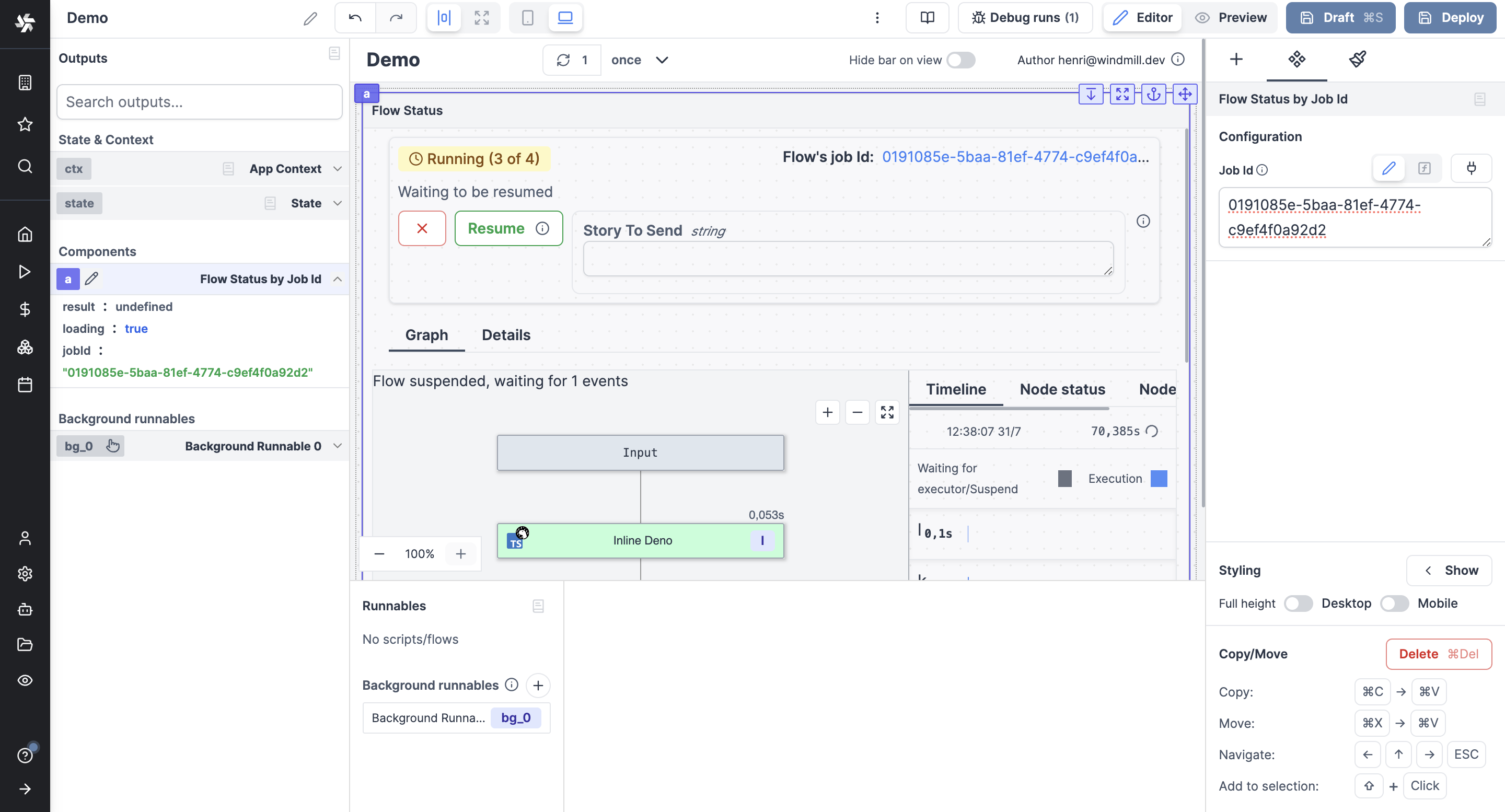
Flow Status by Job Id
The Flow Status component allows you to display the status of a flow by providing its Job id.
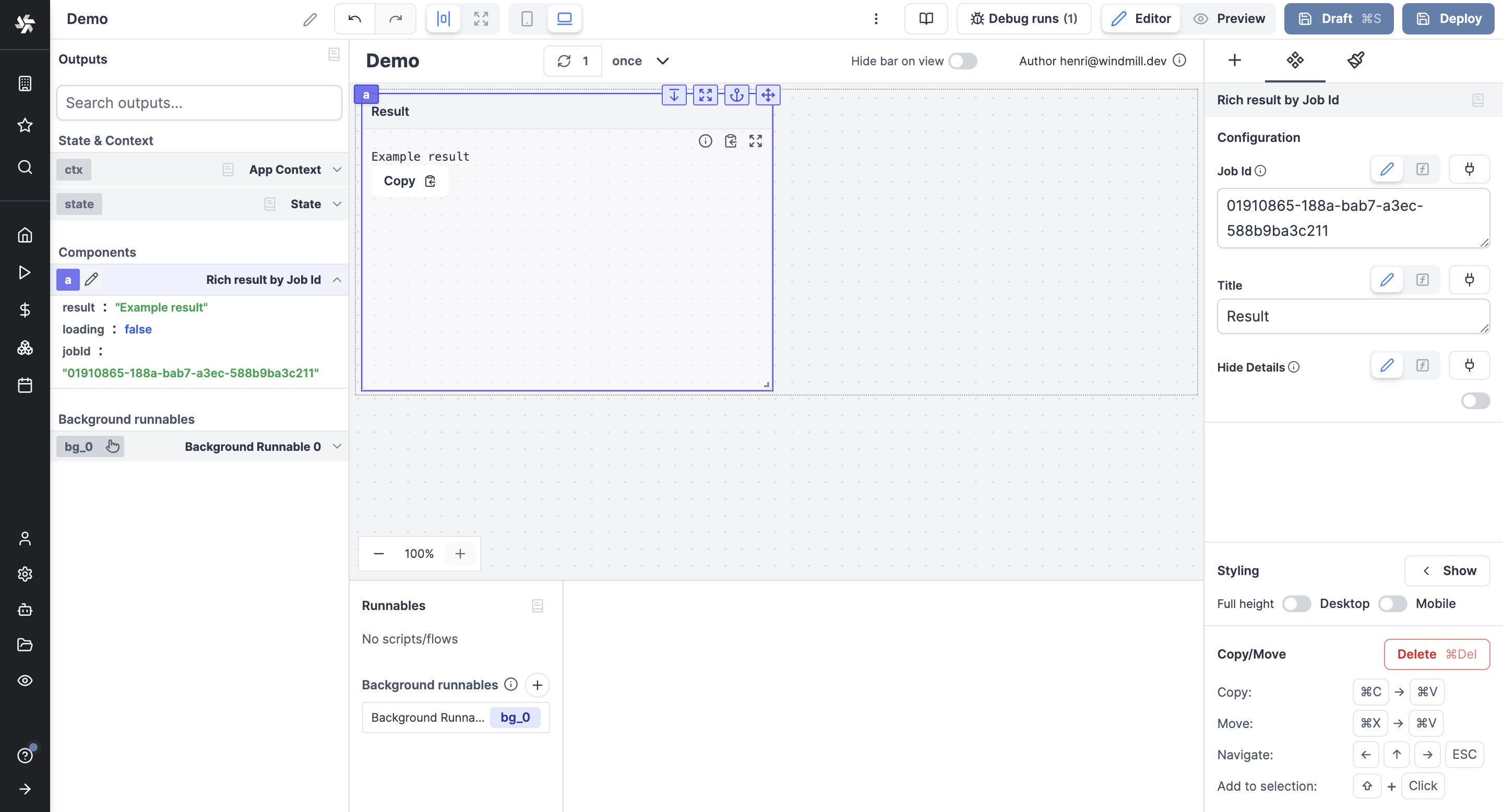
Rich Result by Job Id
The Rich Result by Job Id component allows you to display the result of a Runnable by providing its Job id.
Statistic Card
The statistic card component is a panel meant to display a value and progress.
Dropdown Menu
The Dropdown Menu component is meant to embed one of several Button components and display them in a dropdown menu.
Alert
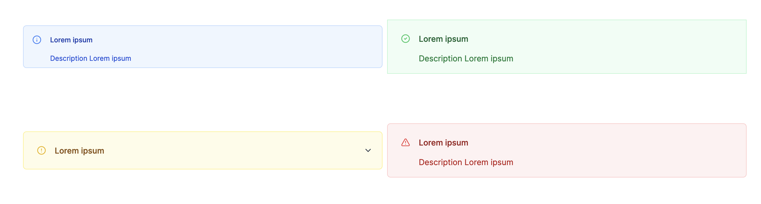
The alert component allows you to display a message in 4 different styles: info, success, warning, and error.
Charts
Plotly
The Plotly component allows you to display a Plotly chart.
ChartJs
The ChartJs component allows you to display a ChartJs using the Chart.js library.
Vega Lite
The Vega Lite component allows you to display a Vega Lite chart.

AgCharts
The Ag Charts component allows you to display a chart using the Ag Charts library.

Groups
Components can be grouped within containers:
Custom Components
For more control and standardization with your existing stack, you might want to import your own components in React.